So Sleek have done it again, another palette that does not disappoint. 12 pigmented colours in a classy looking palette for just £7.99.
I would much rather buy a palette with colours that I can use to create lots of different looks than lots of single eyeshadows, hence my very small single eyeshadow collection. I usually only buy single shadows if the colour is quite unique and something I dont have in a palette that I am itching to try. As you know I was never a Sleek fan until the last year or so, I didnt like the waffled surface on the shadows in the palettes, but now they have changed and have a flat surface I am thrilled, it just looks so much better in my opinion.
But now on to the palette.... For me this is a stand out palette, its a lovely mix of what they have done in the past and some great colours to use together, nothing to bright, lots of neutrals, earthy tones, metallics and some dark colours for that perfect smokey eye. You will notice that under every shade I have added my own names for these shades, I do think that the shades are badly and inappropriately named and have contacted Sleek incase I have a name sheet that is misprinted.
Now on to the swatches....
 |
| PARAGUAYA |
Starting top left as we look down on the palette is the colour Paraguaya, this is an interesting colour that for me is a dupe for the Urban Decay shade WALK OF SHAME or WOS in the Urban Decay Naked Basics palette. Its a lovely creamy fair skintone sort of colour and is a colour i reach for as a base for my other colours every day. This is a matte shade and is very creamy and pigmented, not that that shows well in the swatch but thats because its a very my skin tone colour. I love it!
My name for this colour - Barefoot in India
 |
| SUNSET |
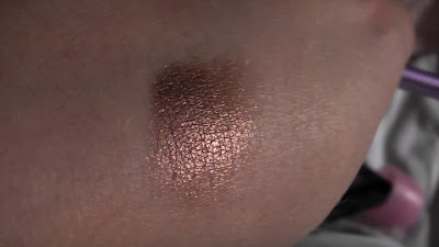
This colour is amazing, its a gorgeous shimmery copper colour that is so creamy and pigmented, this was one swipe of the brush! Though this was a colour I never would have entertained in the past I have warmed to it recently and I cant wait to wear this. Just gorgeous!
My name for this colour - Siam Sunrise
 |
| ME, MYSELF AND EYE |
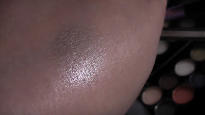
Wow! This is a gorgeous frosty shimmery white that will make an amazing inner corner highlight, brow bone highlight, all over lid colour or lightly used as a cheek highlight to. This is one swipe of the brush to, its very pigmented and creamy and I love this colour, what I will say is that you can get plenty of this colour anywhere else, so its not unique, but its a great addition to a palette because I feel like its a great feature to make a palette an all rounder.
My name for this colour - Diamonds from Sierra Leone (though I do love the name of this one in the palette)
This metallic shimmery old gold is another creamy pigmented shade, this was 2 swipes of my brush. I am not hugely into golds on my eyes unless its a very pale gold, yellow golds are not my thing, but because this has that aged antique gold look its more wearable for me. I would have much rather seen a lovely silver in this palette to go with the jewel tones in the lower row. But overall this is a nice colour and I think this will look great with the purple in this palette (watch out for that combination in an upcoming video).
My name for this colour - Barley Fields
 |
| NOIR |
This is where I think the names seem more than a little strange, this is noir which is black in French. But this is a lovely steely grey shimmery colour not black. Nevertheless I love this colour, its not a colour I own, and this was one swipe of the brush, its so pigmented and pretty.
 |
| ULTRA MATTES V2 |
The name of this amuses me a little, yes this colour is in the original ultra mattes palette, but this colour is in just about every if not all of the palettes, that good old staple of a matte black. Not just a great eyeshadow with creamy pigmentation but also a great shadow to use as a liner. I love this but its appearance in every palette is getting old, i just feel like maybe another amazing colour could have taken its place, because i have enough of these matte blacks in their other palettes to keep me going for life! Come on Sleek lets see a palette without this shade for a change.
My name for this colour - Texas Gold
 |
| OH SO SPECIAL |
Another oddly named shadow, and this just shows these are not necessarily colours from other palettes or at least not all of them, this is not in the OH SO SPECIAL palette at all. This is a lovely blue based dark grey, its matte and smoky and this is one swipe of the brush. Love the colour, I think this is going to look so pretty on the eye and add some gentle drama for those days when you want to be smoky but hold it back a little. Lovely colour, whats up with the name?
My name for this colour - Londons Burning
 |
| BOHEMIAN |
This colour is the brightest in the palette, its creamy but not greatly pigmented, this is 3 swipes of the brush and i think this shade will benefit from a base colour and/or a primer to really make it shine. This is a satin shade and is a pretty coral peach. Im not sure that it fits in this palette if im honest as a whole, it stands out like a sore thumb. Lovely colour just doesnt blend with the crowd so well.
My name for this colour - Delights of Dubai (though i do like the original name to)
 |
| STORM |
I love love love this colour, its not massively pigmented this is 2 swipes of the brush and is definitely a colour that needs a base and/or primer to help it along, definitely a shade that you will need to layer and pack on BUT so worth it. A lovely inky indigo blue that is so much prettier in person than a photo can capture. This is a satin shade to and I love it!
 |
| SPARKLE |
A very appropriate name for a gorgeous shade, I love this and this is one swipe of the brush, its shimmery, creamy and pigmented and I cant wait to use this. Another lovely highlight colour that edges more on a champagne colour for those who dont want that harsh white shimmer. Gorgeous, I thought from looking at it this was going to be a lovely pale gold shimmer (not a yellow gold thank goodness) BUT when swatched this is a true champagne. Love this shade, great addition to the palette.
My name for this colour - Hawaiian Sands
 |
| AU NATURAL |
A very strangely named shade that the picture does not to justice at all. This is a gorgeous rich violet colour with chunks of silver glitter that are not just on the surface of the pan but run through it and show up beautifully on the skin. This is 2 swipes of the brush and its very creamy with decent pigmentation, definitely will work better with a base shadow and/or primer for it to stick to. I love this colour and cant wait to use it.
My name for this colour - Arabian Nights
 |
| GRAPHITE |
Another oddly named colour and a very strange one at that. Not sure if it shows that well in the picture but this is a brown shade, its base is a matte red based brown which you can see at the bottom right of the swatch (which is 1 swipe of the brush so is very pigmented), but the top layer is a cool blue based brown with lots of shimmer, its like 2 colours on top of each other and is very unique. Not sure where it fits in this palette and this is my least favourite colour in the palette if im honest, I would not have put a brown in among these colours at all, it just doesnt seem to fit.
My name for this colour - Broken earth
OVERALL....
I have to say though there are some odd name choices in this palette, a strange brown addition with Graphite and an over kill on the appearance of the standard matte black (how about a shimmery or glitter infused black next time for a change), I love this palette. I love the 2 highlight colours and the indigo and violet shades are amazing. I think this palette gives a lot of scope for creating some great looks. There are neutrals, jewel tones, metallics and most are very highly pigmented and as always they shadows are buttery soft and creamy, a dream to work with - though fall out as usual is present. If you love Sleek shadows this is a great addition to your collection, and if you are thinking of starting this is a nice place to do it. Definitely use a primer with this palette though, I think the colours will really benefit from it and look even better for it. Sleek really do excel with their palettes, they give us colours that you just dont see anywhere else, and cant fault the classy looking packaging either.
I have now had confirmation that the names are wrongly printed on the inner sleeve, so here is a pic of what the shadows should be called.


I love the colors in this palette!! And you are right.... they chose some really weird names!!
ReplyDeleteThank you, i love these colours to and have been reaching for it loads, the sheet inside was wrong but i now have the correct sheet above which does make a bit more sense xx
ReplyDelete