Friday, 5 April 2013

Models Own - Neon polish application review

As promised I have now tried and tested the Models Own neon polish collection, and this is my review of the colours, application and finish as well as durability of the polishes.

NOTE:  I KEEP THESE POLISHES IN A CLIP LOCK TUB IN THE FRIDGE AND THE COLOURS ARE DEFINITELY MORE INTENSE

I have tried a neon polish before, and i noticed that it performed better with a coat of white under it, but still took many coats to get a decent neon finish.  So with this in mind I took the Models Own polish in Snow White and painted half of each nail white....


This was one coat, and I didnt worry about it having any streaks in as it was going to be covered anyway.  

So starting with the thumb, I applied Luis Lemon and boy did the white make a huge difference.


Messy edges aside, this is what the polish looked like after one coat, the white underneath made a huge difference, and that side of the nail was done, no streaks, just amazing neon yellow.  The other side however was very dull and incredibly sheer.  Another 3 coats later and the colour had improved but there was still an element of sheerness to it.  This colour definitely needs a coat of white underneath it to show its true neon.  

Then I moved on to Toxic Apple....


Although this looks a little gloopy here thats more to do with my bad white polish application, like Luis Lemon just one coat and this was a streak free true green neon where it went over the white, and on its own it was very lack lustre and very sheer, another 2 coats later and no great improvement.  This colour definitely needs a white coat underneath it to.

Next, I moved on to Pukka Purple, which even in its bottle intoxicated me.

his


Again, ignoring the messy edges (its hard to get it perfect with a ridgeback dog sitting on your lap).  This colour went on perfect with just one coat on both sides of the nail, it didnt rely on the white to enhance the colour at all and I am even more in love with it on the nail.  

Next I moved on to Bubblegum...


Just like the purple Bubblegum took one coat and was streak free gorgeousness on the nail.  It didnt need the white underneath to enhance it, it went on perfect on both sides of the nail.

The last colour is Pink Punch....


This colour was somewhere between the performance of the yellow and the purple.  The colour went on perfect with one colour, but the side without the white base was a little sheer and needed a second coat to make it a true neon.


So before I sum it all up, here are the stats:

LUIS LEMON - 1 coat perfection, but only over a white polish base to enhance the neon
TOXIC APPLE - 1 coat perfection, but only over a white polish base to enhance the neon
PUKKA PURPLE - Perfect with one coat with or without a white base polish
BUBBLEGUM - Perfect with one coat with or without a white base polish
PINK PUNCH - 1 coat over a white base, 2 coats without a white base polish

CONCLUSION

I love these colours, they are so pretty and so incredibly neon, you have to see them in person to get the true beauty of these.  Perfect for spring/summer and would brighten up any winter outfit.  I think this set would have been better marketed with a white polish because 3 of these colours definitely benefited from that white base to enhance the neon colour.  

They do state that they require a top coat to make them glossy, but for me these already have a satin sheen to them, which is not that far away from the glossy finish of their standard polishes.  Infact I love the finish, because its a little different from a super glossy finish, a top coat does make them look pretty to though.  

What I will say is that these polishes dry very quickly on the nail which is great if you are adding more coats, for me i will just do a white coat before the neon to save myself the time and to just make the colours perform better.  They also are quite thin in consistency, at least the ones that need a white to perform on the nail are, maybe this is why they need the white underneath.

I would recommend these polishes, but you definitely need a white in your collection to get the best out of these.  You wont get a true neon on 3 of these colours without that white underneath.  Overall, though I love the colours, they are true bright neons, not just bright colours being passed off as neons.

My favourites are Luis Lemon, Pukka Purple and Toxic Apple because they are just so different.

Hope you have enjoyed this review and watch out for a review of the scented pastels to.

Live, Love, Laugh


And remember, the name of this blog is UNAPOLOGETIC, I will be honest with you always, you might not always agree, but its always best to hear every side of the story xx

Wednesday, 13 March 2013

Models Own Haul


I have no power to resist the new Models Own box sets, so I ordered both.

I filmed a haul and box opening but have had editing issues so will retry that tomorrow, but till then here are some photos of the polishes.


I got the NEON and the SCENTED collections, and will do a blog post about how many coats it takes to get the polishes opaque and an overall view on the colours and smells xx


And now for the neons!!


Instead of the standard bottle of top coat to make up the 6th item in the set this time they have included the 4 sided nail file and buffer - this is great BUT, I feel the neon set should still have had the top coat included as you need a top coat to make the polishes glossy.


Watch out for the full review at the weekend xx

Live, Love, Laugh

And remember, the name of this blog is UNAPOLOGETIC, I will be honest with you always, you might not always agree but its always best to hear every side of the story xx

Friday, 8 March 2013

My URBAN DECAY Project


This idea started months ago, I wanted to learn how to depot Urban Decay eyeshadows so I could fix them into an old pencil tin where they would be more useful.  I find that i usually reach for a palette rather than single shadows, so I thought what better way to make sure I make better use of the single Urban Decay shadows I have than this.....

However, after researching how to do this, I decided to take it a step further and create a professional looking palette that would look good stood alongside the other official ones on my shelf.

I measured the size of the shadows and bought an empty 28 shadow palette from ebay, I knew it wasnt going to be the best quality at £4 (that was including postage from China), but when the palette came I was thrilled with the quality, its pretty sturdy.

I then got some SHARPIES, in metallic, silver, bronze and gold (£3 for the set on offer at Sainsburys).  I used these to create a fairly simple design on the outside of the palette itself, using the Urban Decay logo and phrasing.


I did this while I was ill in bed, I think I could have made a better job of it but I was really looking for things to keep me busy while I was ill, that said its not a bad job and I quite like that I kept it quite simple.

This is what I used to make the palette:

Hair straighteners
Glossybox paper
Standard scissors
Nail scissors
A towel
Urban Decay eyeshadows
Empty palette
Tealight
Matches
Glue dots

If you want to see how I actually depotted the shadows, fixed them into the palette etc, then please check out my video on YOUTUBE:


But heres how it looks now, its not complete as I need some more shadows to finish it off but its getting there, I had great fun making it and now I can make better use of those single shadows.


LIVE, LOVE, LAUGH

And remember, the name of this blog is UNAPOLOGETIC, I'm going to be honest with you always, you might not agree but its always best to hear every side of the story xx


Saturday, 2 March 2013

MAC - YEAR OF THE SNAKE - ALTERED STATE deluxe eyeshadow

Hey everyone, I thought I would start to do some mini reviews on new products and give you my thoughts on them.  I'm going to start with a deluxe eyeshadow from MAC from the Year of the Snake collection called Altered State


SWATCHES 
(This is a unique shade, a blackened purple that looks different when the light catches it - it has a drama to it that will look great with a vampy eye)


PROS


  1. I love the pattern on the surface of the shadow
  2. The lovely dark purple colour is amazing
  3. It's huge - which means that the pattern has much more drama and you get a lot more for your money
  4. The design of the slipcase is really classy looking, they could easily have gone for quite a cheap finish and i'm glad that they didn't

CONS

  1. The inner packaging being plain lets it down a little, even just a different coloured casing on the shadow would have added that extra drama that would have really made this collection shine
  2. While the colour is amazing, it HAS to be layered as its incredibly sheer.  One swatch is not enough to get a decent colour payoff - just as well it's huge
  3. It's huge and more expensive
  4. The purple looks amazing but when its on the skin it's quite unique, it looks black from some angles, but when it hits the light the purple is worth it (as you can see in the swatches above)

This is the only item I got from the collection as none of the other colours appealed to me, although it is not without fault I do love the colour once you build it and the the unique pattern on the shadow surface is really nice.


Live, Love, Laugh

And remember, the name of this blog is UNAPOLOGETIC, I'm going to be honest with you always, you might not agree but its always best to hear every side of the story xx

Friday, 1 March 2013

MAC Archies Girls Haul (including swatches)


As you know MAC recently launched their Archies Girls collection, limited edition and in all new white packaging with lovely cartoon designs and red love hearts this was a must for us MAC fans.  

I have already posted on the Lucky in Love pigment here on my blog, and you can also see me using it here in this video (step by step guide to this look also on my blog), along with the Betty Bright lipstick on my channel on YOUTUBE.


The collection was split into 4 sections - Betty, Veronica, Archies Girls and accessories and launched here in the UK on Selfridges online first, then a few weeks later on the MAC site and will feature on Debenhams on March 7th.  It sold fast and many items are now out of stock.  This is not surprising, the colours are lovely but also the packaging is so pretty to.

THIS IS THE PROMOTIONAL ARTWORK MAC ARE USING

I love the cartoon artwork MAC have used and how they have played the 2 girls against one another, this is a comic that was out in the U.S but I have never heard of in the UK, but it definitely makes me want to check it out.

So, are you a Betty or a Veronica?


I think as a girl we can always be a bit of both of these, we can be sugar sweet and cute but we can also have that dark vampy side to... or at least thats how I feel I am.  But enough of the waffling already, time for some photos of what I got....


 First of all, how lovely is this packaging, its so pretty!

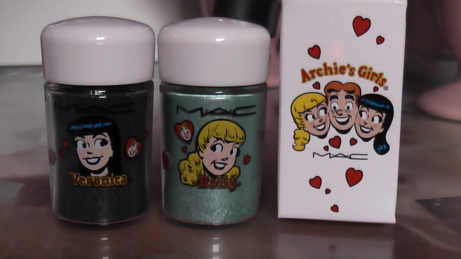
PIGMENTS

MAGIC SPELLS    /    LUCKY IN LOVE

Magic spells is black with teal glitter (Veronica)
and
Lucky in Love is a mint/aqua shimmer (Betty)

HIGHLIGHTER/BLUSHERS
(Pearlmatte face powders)

First Betty


And now for VERONICA


BRUSH SET
(In a tin)


LIPSTICKS
I got all 3 of the Veronica lipsticks and one of the Betty ones


You can also check out my channel for a video on this collection, or watch the video below.


Live, Love, Laugh

And remember, the name of this blog is UNAPOLOGETIC.  I'm going to be honest with you always, you might not agree but its always best to hear every side of the story xx